Websites are a crucial part of businesses in the modern world. They are often the first interaction that potential customers have with a company, so it is important to make a good impression. There are a few rules for graphic design that should never be broken in order to create a website that is both professional and easy to use.
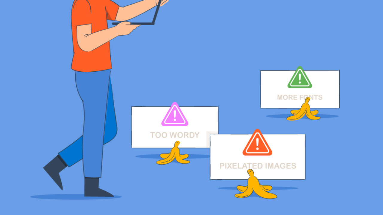
One of the most important design rules is to keep the website simple. Too much clutter and confusion will turn users away. The layout should be easy to navigate and the information should be easy to find.
Another important rule is to make sure the website is responsive. With the increasing use of mobile devices, it is essential that websites work well on all screen sizes. Users should be able to access the website regardless of what device they are using.
It is also important to use consistent branding throughout the website. The colors, fonts, and overall style should match the company’s branding. This will help create a cohesive look that users will recognize.
Finally, it is important to keep the website updated. Outdated information will give users the impression that the company is not keeping up with the latest trends. Regular updates will show users that the company is active and cares about providing the most up-to-date information.
following these design rules will help create a website that is professional and easy to use. Breaking these rules can result in a website that is confusing and off-putting to potential customers.
Always design for the user first and foremost – never break this rule!

Designing for the user should always be the number one priority for any designer. Breaking this rule can lead to sub-par design, which can in turn lead to a poor user experience. By always keeping the user in mind, designers can create amazing experiences that users will love.
Make sure your designs are always consistent – never break this rule!
If you want people to take your designs seriously, you need to be consistent. That means using the same fonts, colors, and overall style from project to project.
Breaking this rule will make your work look amateurish and will likely turn potential customers away. So if you want to be successful, take the time to develop a cohesive brand identity and stick to it!
Always use typography that is easy to read – never break this rule!
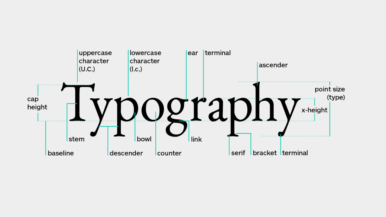
Typography is the art and technique of arranging type to make written language legible, readable, and appealing when displayed. The arrangement of type involves selecting typefaces, point size, line length, line-spacing (leading), letter-spacing (tracking), and adjusting the space within letters pairs (kerning).
Typefaces (sometimes called fonts) are the different styles of lettering that make up the alphabet. There are thousands of typefaces available, and the one you choose will be dictated by the message you want to communicate and the overall tone of your website or document.
Point size is the size of the letters inrelation to the rest of the text, and is usually measured in points (pt). Point size is usually determined by the purpose of the document – smaller point sizes are generally used for body text, while larger point sizes are used for headlines.
Line length is the length of a line of text, measured in characters or words. Line length is an important factor in determining how easy a block of text is to read – if lines are too long, they will be difficult to scan; if they are too short, they will create large gaps of whitespace that can be distracting. The ideal line length for body text is between 45 and 75 characters.
Line-spacing (leading) is the amount of vertical space between lines of text, measured in points. Like line length, line-spacing can affect how easy a block of text is to read – if lines are too close together, they will run together; if they are too far apart, the text will appear disconnect. The ideal line-spacing for body text is 1.5 times the point size.
Make sure your designs are visually appealing – never break this rule!

Your designs should always be visually appealing – never break this rule! This is one of the most important aspects of design, and it’s something that you should always keep in mind. Remember, people judge books by their covers, and your designs are no different. If they’re not visually appealing, people will simply move on to something else.
There are a few things you can do to make sure your designs are always visually appealing. First, keep your colors consistent. People should be able to easily identify your brand by your colors, so make sure they’re always used in the same way. Second, use high-quality images. People are visual creatures, so using stunning images will really capture their attention. Finally, make sure your designs are always clean and organized. Cluttered designs are simply too confusing and off-putting for most people.
By following these simple rules, you can be sure that your designs will always be visually appealing and engaging.
Always test your designs before publishing – never break this rule!

It is always important to test your designs before publishing them. This is because you never know when a design might break and cause problems for your users. By testing your designs beforehand, you can avoid any potential issues and ensure that your designs are always up to scratch.